Lost Sock Creations

Lost Sock Creations
what it's all about...

Tuesday, September 10, 2019

Value Scale


VALUE 

DEFINITION: 
VALUE is the darkness or lightness of a color or greyscale. 
Value can be use on a 2D SHAPE to make it appear as a 3D FORM. 
This is called SHADING.

Here is an example of shapes before and after adding Value with pencil. 


VALUE SCALE
When VALUE is put in order from light to dark in a scale. 
When you create value, it should be 
Smooth, Even, and have Contrast. 
Take a S.E.C. to check your values. 

This worksheet is a wonderful way to practice your value scales in a variety of ways. 
You can print it or make your own scales...


Most beginner artists shade with PENCIL, Colored Pencil, or Crayon
This is the easiest way to shade because it uses pressure to create darks and lights. 


Advance artist may prefer the more challenging way to shade, which is with 

PEN and INK. 

This does require spacing of lines or patterns rather than pressure. 
The closer the lines and patterns, the darker the value. 
The further apart the lines or patterns, the lighter the value. 

The most used techniques are:
Hatching
Cross Hatching
Stippling and Scribbling. 

BUT there's more!!!.... 
Video Tips on creating INK VALUE SCALES.


Click Image to see how these EGGS are shaded...


Edward Gorey- Illustrator, Master of Pen and Ink


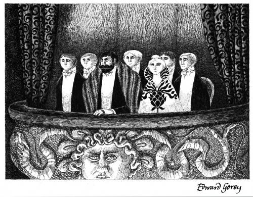
Here are some examples from Mrs. Morgan's Portfolio using pen and ink :
What techniques can you find?


COLOR
also has Values. 
What order would these colors goin in if in a VALUE SCALE?


ALSO
Each color can become a TINT (adding white) or a SHADE (adding black)
to create a darker or lighter version if itself. 

Take a S.E.C. to watch this before you begin with your value scales…
It will show you how to create Smooth, Even, and Contrasting (SEC) Value Scales. 

IN YOUR JOURNAL
VALUE

Definition- How Light or Dark a color or hue can be. 
Values in order on a scale can show visual organization. 
VALUE added to a 2 dimensional SHAPE can make it appear as a 3 dimensional FORM
Value/Shading on a shape changes according to the LIGHT SOURCE
Create a Smooth (1 direction) , Even (equal amount of each value), and Contrasting (darkest and lightest) Make a VALUE SCALE for each medium: 
pencil, colored pencil, crayon, and ink (4 techniques).  
Note that PENCIL, Colored Pencil, and crayon use PRESSURE to create VALUE. 
In contrast, INK requires SPACING or lines/designs to create VALUE. 
-------------------------------------------------------------------------------------
Projects to Follow Scales

Shady Pumpkin
https://tabithaannthelostsock.blogspot.com/2023/09/shady-pumpkins.html

Pop Art American Flag

3D Columns

Glowing Hand

Value in Cubism

Crystal Gem Creations
https://tabithaannthelostsock.blogspot.com/2017/04/crystal-gem-creations.html


Friday, September 6, 2019

Pop Art Name


We designed our names in 6-8th grade art 
in the PopArt Style of Roy Lichtenstein. 
This is some of his art...
if you click on it, you can see it bigger. 

This is young and old Roy Lichtenstein. 
His art was BIG!


What colors does he use?
How does he make his colors get lighter?
How does he make other colors? 
How does he make some of his paintings look animated, like they are alive?

Lichtenstein was in a group of artists called the POP artist. 
They all created art in the 1950's based on POPular culture. 
The televisions was becoming common in American homes, 
and allowed things to become more well known and popular in our culture. 
Things that were popular in the 50's were:
Marilyn Monroe, Elvis Presley, The Beatles,  James Dean, 
Campbell's Soup, CocaCola, LifeSavers candy, PEZ candy, 
Tin Toys, Rollerskates, slinky, frisbee, and Comic Books. 

1816- Invention of the Camera. 
1927- Invention of Television

Let's study what POP art is. 
Here are some videos that talk about that... 


The artist we are learning about is a POP art artist. 
His name is Roy Liechtenstein. 
He used the popular comic books as his main subject. 
He would take a small picture and enlarged it to allow you to see 
the Ben Day dots and the Primary Colors. 
Red, Yellow, Blue, black and white were the only colors used in old comics. 
They stacked them on top of each other to create orange, green and purple when desired. 


Today's Printer carries ONLY these three colors with black. 


Looking at Lichtenstein's VAROOM as our inspiration piece,  
you are going to create your name in box or bubble letters. 
You will use the Trace and Erase method that you learn from me...  
You will  use shapes or lines around your name to make it appear as though it is in action. 
It has to be "ing". 
Exploding, hopping, dripping, moving, zooming, booming.. somethING. 
Now, Look closely at VAROOM painting by Roy Lichtenstein. 
Look how he made a circular burst around the word, then lines that go outward around the word and then even more shapes to look like flying debris. 

You will design, using only primary colors plus black and white. 
(Primary Colors are Red, Yellow and Blue). 
This is to mimic the printing abilities that were available in the 1950’s when pop art was new. 


--------------------------------------------------------------------------------------------------------------------
HOW TO BEGIN-
Start with pencil. Draw your name lightly. Trace around your name lightly. 
Make your line a shape. Draw a shape around your name and lines too. 
Here are 2 guides to help you do your lettering. 


After you have your letters in place, 
You can look at "pop art names" on google images to get ideas. 
You can outline the final drawing with black marker if you like. 
Then color with primary colored markers; red, yellow and blue. 
You can also use grey and black. 


-----------------------------------------------------------------------------------------------------------------------------
Spring 2023


Spring 2022


Winter 2021


Fall 2021


Fall 2020


Fall 2019


Aubrey in 6th grade wears POP ART with class to class. 

Related Lost Sock Projects of the Past

Check out this POST POP ARTIST
Akira Yonekawa
I looooooooove her art. 
(click on the image to see the Ben Day dots)
https://www.akirayonekawa.com/

Pop Art Onomatopoeia

New Year Pop Art

Use this Roy Lichtenstein Coloring 
sheet as an Introduction