


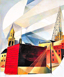
PRIMARY Painting
"I Saw the Figure 5 in Gold"
Painting by Charles Demuth
In this painting, the No.5 of a red fire engine is emphasized with bright colors of Gold.
The contrasting dark street lines behind it are pointing from the center in grey, black and white.

Secondary Paintings


Notice the similarities and differences between these three Demuth paintings and the Primary one.
How is Line and Value used in all of them?
HIS STYLE-
Dumuth was part of the Precisionist Movement that began in 1920 in the US.
It emphasizes clear lines and simple geometric shapes.
IN YOUR JOURNAL
What are different ways you can make your NAME contrast the background?
Should it be skinny lines or big shapes?
--Practice making your name in shape letters (box or buble).
How can you use color, line, or pattern to make it stand out from the background?
---Experiment with creating contrast on your pages.
What are different compositions you can use to arrange your name?
--Experiment in thumbnail drawings of the composition/arrangement of your name on your pages.
---Draw your final idea for your shape name, background, and contrasting design idea on a notecard.


Natalie’s Notes.
Criteria for
Contrasting NAME DESIGN
We will use the primary painting, I Saw the Figure 5 in Gold by Charles Demuth, as our focus.
There are number shapes scattered in various sizes in the painting. You will scatter your name on the paper. Lines are spread over name and in background, going in different directions over the paper, dividing it up into sections.
1. SHAPE OF LETTERS
You will use your name with scattered shape letters balanced on your page.
You can begin with line letters, but then box around them to create a shape.
In order to EMPHASIZE your name, it must be BIG and BOLD SHAPES, not skinny lines.
Here is how...


2. DIVIDE THE SPACE
Use lines and shapes around your paper to divide it into sections.
try to keep the paper visually BALANCED when you add more.

Here you can see how the Primary Painting is divided up...


3. EMPHASIS & CONTRAST in Design
It is Your NAME you want to Emphasize!!!
How do you do that?
Emphasizing is making areas of a work stand out more than others. You can do this by adding thicker/bolder lines around and object, a brighter or lighter color in the object, making an object bigger, or pointing lines towards the objects.
How can you show Visual Differences/Contrast in your work?
Make a choice...
with COLOR, you can use Dark & light, Color & Greyscale,
Color Complements/Opposites, Tints (lighter) & Shades (darker).
With LINES, you can use Thick & Thin,
Tight & loose, or Sharp & Soft,
BE CREATIVE !!!
Choose a way to create emphasis and contrast with your name from the backgrounds of your paper.
*All areas should be filled up with color or design.
------------------------------------------------------------------------------------------------
Dark and Light colors
Colors do have VALUE. If you take a picture of colors and take away colors,
VALUE is what is left.
Light stands out of the Dark.
Choose lighter colors for your name and darker colors for the backgrounds.
(see colors values above).Here is used darker values of marker color in the background and
lighter values of color on my name...


All COLORS have VALUE (dark or light)
The most obvious light color is yellow and the darkest is violet.
Transfering colors to greyscale helps you see the values.


High Contrasting Colors
Choose Complementary Colors (across the color wheel from each other) to make each other stand out.
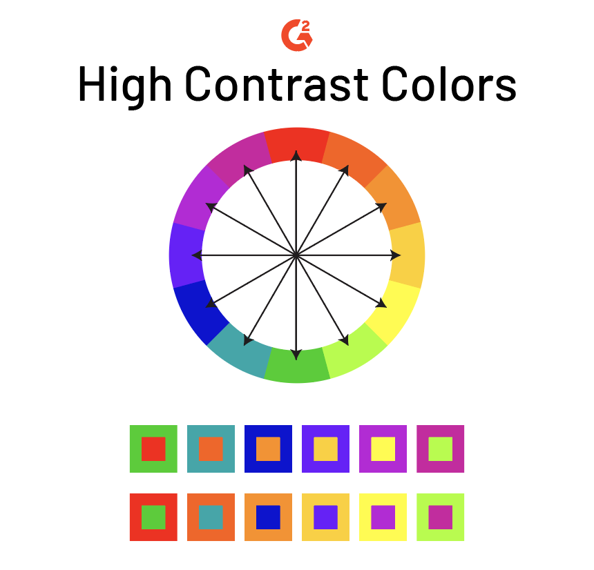
You could use Oranges for your Name and
Blues for your background.
Because Orange is brighter and lighter in Value, it will stand out more.
or,
You could use Cool Colors for your background and Warm Colors for your Name.

Example below have been temporarily borrowed for inspiration...
origins of art are listed beneath each example.

Ms. Johnson1 of Crestwood Community Middle School
More examples here..
contrasting with Warm and Cool Colors
High Contrasting Patterns


Changing direction of angle, thickness, or value of a line/pattern can create contrast.

Making lines or patters closer together makes them appear darker.
Making lines or pattern further apart makes them appear lighter.
You can use heavy darker patterns for you background and
lighter patterns for your letters.
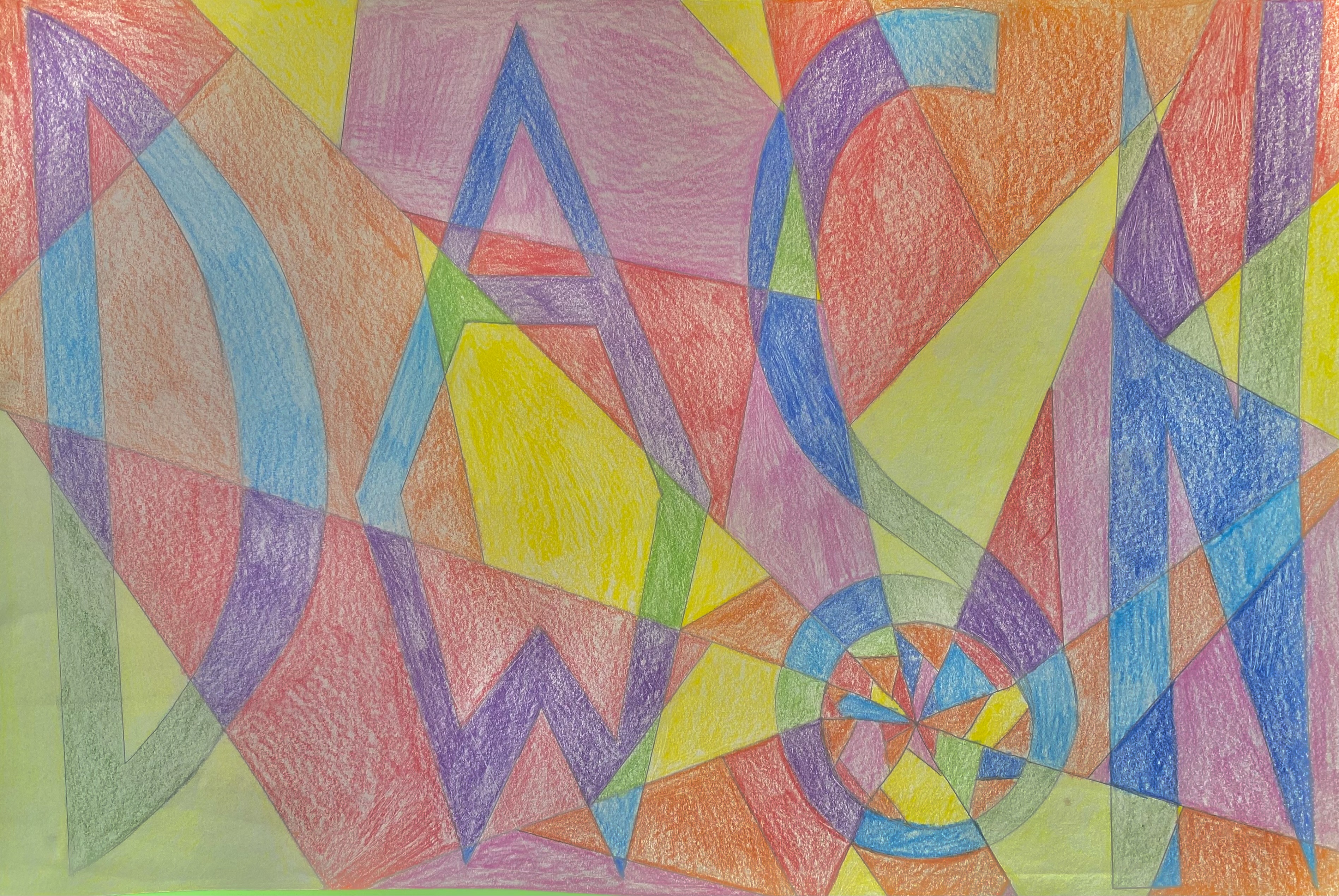
Student Examples
Emphasizing with Cool and Warm Contrast


Emphasizing with Darker Shades and Lighter Tints


Contrasting Color Compliments (opposites)


Emphasizing with Bright Color and Black/White Pattern


Invented Ways to show Emphasis


*Play around in your sketchbook journal with ideas of how to create your
Contrasting Name Design.