Lost Sock Creations

Lost Sock Creations
what it's all about...

Friday, April 12, 2013

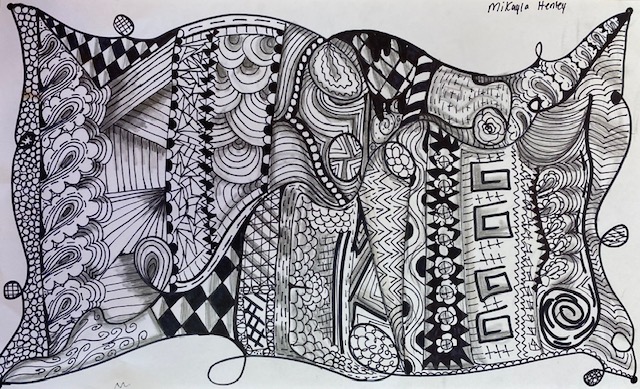
ZenDoodles!

Kyla, Braylynn, Yarelli (2021)


I love doing ZenDoodles with the kids. I show them YouTube clips of artist in superspeed creating these doodles. I explain to them that doodling uses the subconscious creativity. I compare it to "daydreaming with a pencil". I make them understand the they are not "drawing" anything intentionally. It is just using lines, shapes, patters, and designs. So, it is encouraging to tell them that they cannot mess up!
So, I make them use a pen to doodle. That way they cannot backtrack or try to "fix" anything. 
After the doodle is completely filled up, I have them use a pencil and blendy stump to make some areas in the doodle appear 3D. I have them shade parts that would be considered underneath areas of the doodle. 
They have fun and it is the most quiet class periods I have the entire year. 
All of these are done by kids that range from 6-8th grade.


Mikayla H. 8th grade 2021


Older examples from MMS circa 2012


Ellie


Shanna
 It does look nice on colored paper too, as long as it is lighter in color.
This bottom one is done by me as a teacher example of different ways of doing the doodle using colored construction paper with white and black colored pencil to shade.


Friday, April 5, 2013

We Can Do It!... Art Classroom Encouragment

I felt like the kids around my art classroom needed a little boost of encouragement. 
They make such amazing things and don't realize that this is a gift from above. 
They get discouraged when the compare their work to others that may be more advanced around them in the room. But, I have learned as a regular 2nd place B Team kinda girl, that you just do YOUR PERSONAL best. Comparing yourself to others will do nothing but bring your down. I have discovered in my closer walk with Him, that when I get down on how I was created, I am INSULTING MY MAKER! That is the last thing I want to do is offend my Creator. 
I passed by another teachers classroom one day and saw a poster in her room. I have seen it many times before but never really hit me as anything personal. I love the design and the colors, but I really do not consider myself a feminist.I thought that it was more of an "In You Face Stinky Boys!" kind of hateful message, rather than what it really is. I thought that was what the poster was about, but I was naive.
When I really researched the picture itself, I realized it's original purpose and was very please with my discovery. 

  http://en.wikipedia.org/wiki/We_Can_Do_It!

Did you know the lady in the poster was
Geraldine Hoff, not Rosie the Riveter...?


So, just like the Geraldine Hoff's image encouraged the Westinghouse workers to work to their own personal best capabilities, I want to also encourage myself and my students to work their best in the art room. In case you did not notice, I changed my patch on my collar to represent my faith and art. I was nudged by Christ to start an after school program at the school to aid students in ""Creating for their Creator". We decided to call it Art With a Purpose (AWAP). This badge signifies my allegiance to the idea of a higher power being the backbone of my creative success. I did not create myself, so I cannot take credit for anything that I make. I own all my success and power to the One that strengthens me...

Thursday, April 4, 2013

2013 East Texas Art Educator Share Fair! AWWW YEAH!

  
If you follow my blog, 
It is for sure you love teaching art or love to dabble in new lesson ideas. 
Either way, if you live in the East Texas area you are in for a treat.
Mineola ISD is hosting their 2nd East Texas Art Share Fair.
Last year was the first and was a huge success. 
So, it is back again. 
Please join us in sharing our favorite lessons and handouts. 
Feel free to bring your own to share as well.
If you are interested in joining or have any questions, 
please email me at my school web address;
seatont@mineolaisd.net

You must email me before June 7th to mark your place in the event.
Below here is a less cool, printable version of the flyer to share with other art teachers you may know. 
Hope to see you there!


Thursday, March 28, 2013

Monochromatic Atmoshperic Perspective Digital Art

Dallana, 7th grade

THE ASSIGNMENT
Before we begin, I explain these things to the students.
I talk about what Monochromatic Color is referring to Tints and Shades.
I go over how perspective in art shows how things appear to be smaller, less detailed, and occasionally lighter as the go further back towards the horizon line.
I talk about how they do not really do this, it just appears that way to the viewer. 
If I walk away from you into the sunset, I do not really shrink, lose detail, or get lighter. 
Our eyes just make it appear so. 
Then we march to the computer lab and we open Microsoft Paint.
I go over quite a few hints to help them get started.
I explain how the magnifying glass can help them add small detail more successfully, how to create new colors and get to the tints and shades of them, and how to avoid paint spilling out of open shapes. I stress saving their work continually after each step to avoid erase work while reminding them that "Edit/Undo" can only be done minimally.
Despite this constant reminder... some still had a hard time. 

Hope you have wonderful results!
Please share any that you do. I would love to see them.

Haley, 7th grade


Ashton, 7th grade

Brianne, 7th grade

Cederick, 8th grade
Mrs. Seaton

Step by Step
1. Draw in three or more layers to your landscape.
There should be a foreground, midground, and background.
(sky does not count as 3rd layer)
2. Choose only 1 color you like on the paintbox 
3. Use that one color (MonoChromatic) to create your picture. You will used different tints and shades of this 1 color to make the atmosphere appear to go back and fade in the distance. 
4. Fill in each layer getting lighter as the land recedes.
5. Go to first layer to put in more detail (grass texture, tree bark, leaves, etc). 
Use darker shades or black to add in the details. Do not let this later get lighter by adding in lighter details. 
It should stay darker than the middle layer.

Step 1 and 5


Steps 1, 4, and 5.


to see more student examples...
go to
http://classroom.mineolaisd.net/default.aspx?Mrs.+Tabitha+Seaton%2FMonoChromatic+Landscape


Wednesday, March 6, 2013

Sketch Artist in the classroom, helping to catch LEPRECHAUNS!

Almost every year, this mischievous creature finds it's way around our school and helps himself to our valuables.  This year I think we are lots of luck to catch him thanks to the 6th grade artist that stepped up to attempt to illustrate the urgent article last week. 
Thank you for having a good ARTtitude and really using your talent and care to help catch this little guy in his tracks!
Your gold is waiting for you in the Middle School Office...
Enjoy your rewards. 

Alex 6th grade

Jerrie Lee 6th grade


Josh C. 6th grade

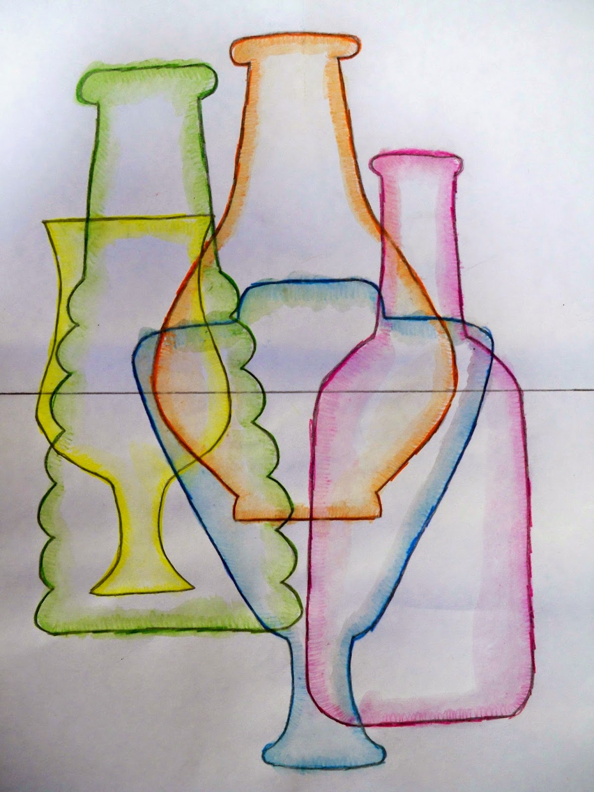
Rainbow Glass Still life.

I was inspired by something I saw. 
It was overlapping glass bottles of various colors with the light shining through.
The places they overlapped created an array of new colors!
It was FANTASTICAL!
SO, of course, I went out to create a lesson.

I found these images to add to a powerpoint to show the students
since I do not own a wide variety of colored glass to display for them in the room. 

When the students arrive in the room, I have them all get one piece of computer paper, a pencil,  and a scissor. 
They fold the paper in half,  and draw a line from top to bottom starting and ending at the line of symmetry. 
Then they cut along the line and open to reveal a unique form that resembles a bottle. Then they write their names on them.
If they are successful, they can use it as a pattern for the project or allow others students in class to use it as well. We use these symmetrical patterns created by the students to trace onto a 12 by 18 inch paper.
They need at least 5 bottles and that overlap. 
The bottles that are in the back should be slightly higher on the paper to look like they are further on surface.

Then they use watercolor pencils around the forms and may slightly add shading going further inward if desired. 

Next, they use a wet brush to paint each bottle one at a time. It will be more successful if they start with the lighter colors first (yellows first then blues and purples last). 

I was experimenting after photographing, and opened the above image up in Microsoft Paint and inverted colors. I liked the way it turned out, I decided to do a hard copy for example with a different medium.
(See below) 


Here I repeated the first steps, but used construction paper crayons instead of watercolor pencils. 
I also added some white crayon with contour lines to add a light glare. 
I really like both ideas...

Can't wait to try it with the students after Spring Break!
I will post results... 
Adriana

Alexis

Ashton

Brianne

Cederick

Cheyenne

 Drason

Emma B. 


Haley

Ian 

Indy R. 


Juanita

Lanie

Lily H. 

SHanna

Tanner