Mrs. Johnson's 2nd grade
Carter, Ria & Reggie
-------------
Mrs. White's 2nd grade
Justine,
Angel, Valery,
Kayla, Patrick,
Emma & Hailey
---------
Mrs. McMillian's 2nd grade class
Nicolas, Danish,
Christopher & Miya.
-----
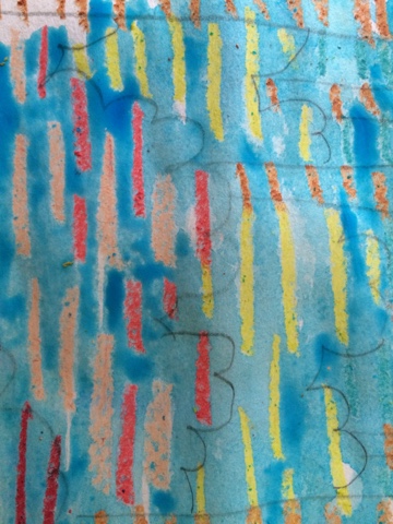
CONTRAST-
In design, the definition of Contrast is:
Definition: refers to the arrangement of opposite elements (light vs. dark colors, rough vs. smooth textures, large vs. small shapes, etc.) in a piece so as to create visual interest, excitement and drama.
Dark against light. Dark colors make light colors appear brighter.
Cool against warm.
Cool colors make warm colors seem brighter!
Subject: Light is only made bright by darkness
Here it is: light is only made bright by darkness. This means, essentially, that in order to have anything, you must have the opposite.
Examples:
-to make a color stand out, put it next to it's opposite
-to make a drawing look bright, put in shadow
Why the SUN AND MOON?
Many people use the design of the sun and moon to show balance in life. In order to appreciate the sunny times, you have to know the dark times.
-to know pleasure, you know pain.
This project focuses on design using the contrast of cool & warm colors.
Using a compass, draw a large circle in the center of the page.
Draw a curved line in center to divide the circle into sun and moon. The smaller side will be the moon. Draw a sleepy face on moon side and a happy face on sun side. They will share a mouth.
Draw line patterns on each side of circle, having the sun & moon designs being different.
Mrs. White's class working (2nd grade)
Desmon & Kayla


