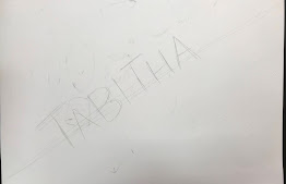
We designed our names in 6-8th grade art
in the PopArt Style of Roy Lichtenstein.
This is some of his art...
if you click on it, you can see it bigger.
This is young and old Roy Lichtenstein.
His art was BIG!
What colors does he use?
How does he make his colors get lighter?
How does he make other colors?
How does he make some of his paintings look animated, like they are alive?
Lichtenstein was in a group of artists called the POP artist.
They all created art in the 1950's based on POPular culture.
The televisions was becoming common in American homes,
and allowed things to become more well known and popular in our culture.
Things that were popular in the 50's were:
Marilyn Monroe, Elvis Presley, The Beatles, James Dean,
Campbell's Soup, CocaCola, LifeSavers candy, PEZ candy,
Tin Toys, Rollerskates, slinky, frisbee, and Comic Books.
1816- Invention of the Camera.
1927- Invention of Television
Let's study what POP art is.
Here are some videos that talk about that...
The artist we are learning about is a POP art artist.
His name is Roy Liechtenstein.
He used the popular comic books as his main subject.
He would take a small picture and enlarged it to allow you to see
the Ben Day dots and the Primary Colors.
Red, Yellow, Blue, black and white were the only colors used in old comics.
They stacked them on top of each other to create orange, green and purple when desired.
Today's Printer carries ONLY these three colors with black.
Looking at Lichtenstein's VAROOM as our inspiration piece,
you are going to create your name in box or bubble letters.
You will use the Trace and Erase method that you learn from me...
You will use shapes or lines around your name to make it appear as though it is in action.
It has to be "ing".
Exploding, hopping, dripping, moving, zooming, booming.. somethING.
Now, Look closely at VAROOM painting by Roy Lichtenstein.
Look how he made a circular burst around the word, then lines that go outward around the word and then even more shapes to look like flying debris.
You will design, using only primary colors plus black and white.
(Primary Colors are Red, Yellow and Blue).
This is to mimic the printing abilities that were available in the 1950’s when pop art was new.
--------------------------------------------------------------------------------------------------------------------
HOW TO BEGIN-
Start with pencil. Draw your name lightly. Trace around your name lightly.
Make your line a shape. Draw a shape around your name and lines too.
Here are 2 guides to help you do your lettering.
After you have your letters in place,
You can look at "pop art names" on google images to get ideas.
You can outline the final drawing with black marker if you like.
Then color with primary colored markers; red, yellow and blue.
You can also use grey and black.


-----------------------------------------------------------------------------------------------------------------------------
Spring 2023
Spring 2022
Winter 2021
Fall 2021
Fall 2020
Fall 2019
Aubrey in 6th grade wears POP ART with class to class.
Related Lost Sock Projects of the Past
Check out this POST POP ARTIST
Akira Yonekawa
I looooooooove her art.
(click on the image to see the Ben Day dots)
https://www.akirayonekawa.com/
Pop Art Onomatopoeia
New Year Pop Art
Use this Roy Lichtenstein Coloring
sheet as an Introduction


