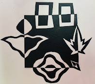
I found this book over the Summer and was so excited and inspired by all of the ideas it held.
I could not wait for the school year to begin so I could start letting my advanced art 8th graders using the knifes!
Cut Up This Book by Emily Hogwarth
POSITIVE & NEGATIVE SYMMETRICAL DESIGNS
My 8th grade advanced art students are learning how to use an art knife properly.
I had them cut our designs using both the positive and negative spaces as part of their design.
I think they turned out great.
These are just the beginning of some amazing things they will be doing.
Start Simple
NOTAN ART
Look at images of Notan Art
Find 3 Notan designs that inspire you.
Find one that is simple, one that is an achievable challenge, and one that is crazy good.
Copy them, save them, and share them with me.
Watch this video...
Notan Designs.
You will create your own design with a black square as well.
make sure to follow instructions and tips from the video to keep it neat.
Advanced Art 2022
Carie Adair and Peyton Marshall
Jannette, Maleighna & Fransisco.
Josilen Martinez ,Lydnie Key, and Danielle Voyles
MAGAZINE MANIPULATION
This is PrePhotoShop stuff here.
Cutting one or more images into shapes and rearranging them to make you see the image in a new way.
This can be combining images, stretching out an image, weaving images, shattering images....
Notan with Magazines
Cut 2 and Switch
repeated lines on 4 edges cut and stretched
Weaving 2 Images
----------------------------------------------------------------
POSITIVE AND NEGATIVE Art
From Miss O'brein's ArtClass
(click pic to see more)
See some of Sharyn Sowell's creative cuts here....
She is the O.G Creative Cutter!
click pic to see more...
This is similar to Notan, in the fact that you use all the pieces that you cut out.
Only, instead of cutting from the edges and going outward, you cut from the middle and move to another side completely, making 2 pictures from the same paper.
This image can be flipped and symmetrical (like Miss O'Brein's class),
or it can be simply slid over and glued down, like below.
Above from 2022 Advanced Art
POSITIVE MESSAGE from NEGATIVE SPACES
After they completed their symmetrical designs, we moved on to bigger and better ideas.I decided to begin a lesson about cutting, but instead of keeping those little bitty negative pieces like the last assignment, we were able to toss those in the trash. I gave all the students a white poster-board. They were told to do a timeless design (landscape, quote, inspirational idea) on their poster. But, they had to think before they drew. They had to know that each cut would come out. So, I suggested them to use smaller shapes rather than large. When large shapes are cut out, the structure begins to be floppy. It needs supports left into the design to make a nicer quality piece.
These designs were mean to be put into a window to allow the light to gleam through the negative spaces creating a design on the ground below. After we were done, we laminated them to keep them staying together and for extra support and shield from weathering.


