Post Post Artist
Patrick Edgeley
Patrick Edgeley is a Post Pot Artist who is inspired by popular items of the past.
One of the things that inspired his art is packaging for soda.
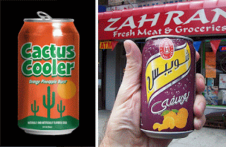
He used ideas from vintage soda cans to create the print above.
Look at these cans above.
Click on each one to see them bigger
Which one is your favorite?
Which ones catch your eyes the most?
Why?
Notice how some have interesting flavors, mascots, fun lettering, bright colors and some do not.
What goes into designing a soda can label?
Interesting and Unique flavor.
Clear Communication on flavor.
Design related to taste and ingredients.
Creative Lettering.
Fun Pictures.
Ingredients Listed.
Eye catching color.
Hold Up...
Even wonder what those little colored circles are for on the back or side of your food and drink?
It's a color code for printing the package.
Most printers only use the three primary colors in different intensities/values ,
blend them together or with black or white.
See here how Soda Cans are made. They print 5 colors.
Before you begin, practice blending colors on a worksheet.
1. Choose 2 similar but different colors.
3. Using the dark color, create a
Smooth, even, contrasting value scale.
4. with the lighter color, go over entire area very hard.
5. Check to see if there is any white flakes left, fill in with lighter color.
----------------------------------------------------------------------------------------------------
Here is your
PROJECT REQUIREMENTS
1. Unique flavor blend (more than one flavor)
2. Name related to flavor
3. Mascot and Slogan related to drink
4. Colors related to drink
*Maximum amount of colors is 3 with black and white added.
5.
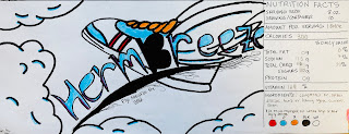
Ingredients and Nutrition facts listed on label
From flat design to bottle...
This lesson is "SO-DA" Bomb!!!
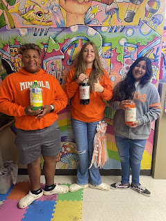
Have fun with bottling up this lesson and using food coloring to make it authentic.
This is what I see every morning when I walk into my classroom!
Beautiful!!!
Worksheet for a 2 Liter Bottle
High School Advanced Art 2024
8th grade Advanced Art Students from 2021
Students from Mineola Middle School
2005
Drawing and Coloring
In our classroom, we have been going over creative lettering and how it leads to creative advertising.
See lessons here...
I gave them (7th/8th grade) a blank space for a ColaCan label with some rules and they went and showed off their skills. I think I am most proud of them on this assignment than most others this year. They showed me they know how to follow instruction while also being creative. That is the most important part of teaching... to show them the way and then let them go away with it!
I am proud of them.
2014 Examples
Alexis N, 8th grade
Larry, 6th grade
Caitlyn 6th grade
Courtney V. 8th grade
Faith R. 6th grade
Ashton, 8th grade
Shanna, 8th grade
Ty West, 8th grade
Past Year Examples
Original Idea modified from
Art Projects
Middle Schoolers Can't Resist!


